Client
Unite Communications
Role
UX/UI Designer
Timeline
3 Months
Unite Communications is a telecom service provider specializing in offering businesses seamless communication solutions at a cost-effective price. Despite their exceptional services, the company faced a challenge with their outdated branding and website, which failed to reflect their innovative approach and high-quality offerings. Seeking to enhance their brand perception and online presence, Unite Communications approached us for a strategic redesign.
Objectives
01
Update the overall look and feel of the brand to reflect modernity and professionalism.
02
Maintain brand recognition by retaining the existing logo while refreshing the brand’s visual identity.
03
Design a new website that aligns with the updated brand identity and provides a seamless user experience.
Process
Research
User Demographic Overview
During the research phase, we conducted a comprehensive analysis of Unite’s user demographics to gain insights into their audience’s preferences and behaviours. The demographic overview revealed a user base primarily skewed towards males, primarily based in Toronto. The age distribution was diverse, with a significant portion falling within the 25-44 age range (although representation across the 18-64 age range was also notable).
Device Preference:
Analysis of user behaviour also showed that the majority of visitors accessed Unite’s website via mobile device, with Google and Safari as users’ primary browser choices.
The website’s current U/X and U/I were both less than ideal on mobile. Given the prominence of mobile users, mobile usability and aesthetics needed to be optimized to ensure an optimal user experience across multiple platforms.
Initial User Journey Overview:
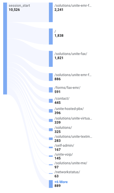
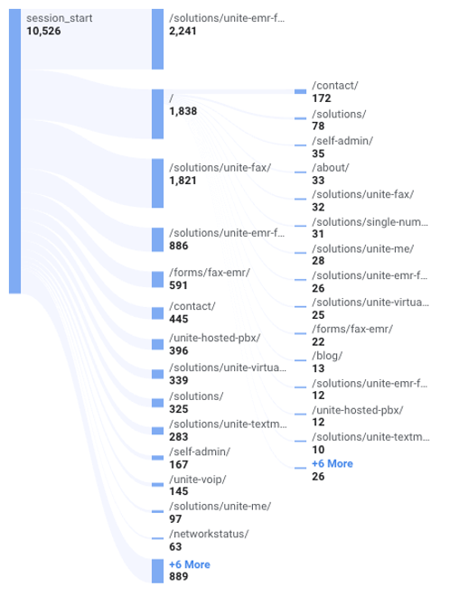
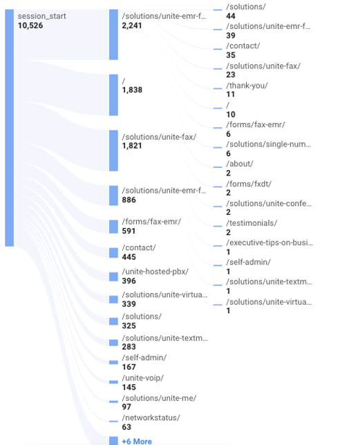
A detailed examination of user navigation patterns provided valuable insights into the initial user journey on the current website. The research revealed that approximately 21% of users landed directly on the Unite EMR Fax page (one of the exclusive services provided by Unite Communications), indicating a significant interest in this specific service. Additionally, the home page served as the starting point for a sizable portion of users, with approximately 30% of visitors continuing to explore other pages or take conversion actions. Furthermore, research showed that 26% of users landed on various fax-related pages, indicating a significant interest in fax-related services or information.
However, it was concerning to note that only 8% of users who landed on the EMR Fax Page proceeded to navigate to other pages, suggesting a potential disconnect or lack of engagement with the rest of the website’s content. Conversely, the home page demonstrated better retention, with a higher percentage of users transitioning to other pages or conversion actions.
Additionally, approximately 9.4% of users navigated directly from the home page to the Contact Us page. Although this is a desired conversion action, it may also indicate users are confused and seeking help. This is especially troubling, considering that only 17% of those who clicked Contact Us went on to submit the form. Meanwhile, more than twice the users (38%) went back to navigate the site.
Ideation
Leading the design, I leveraged a variety of creative tools and techniques to explore different design directions and possibilities for Unite Communications’ brand identity and website. This phase was crucial in translating the insights gathered during the research phase into tangible design concepts that would resonate with the target audience and align with the client’s objectives.

Mood board
To kickstart the ideation process, we curated a mood board that served as a visual collage of photography, colours, textures, and typography. The mood board was meticulously crafted to evoke specific emotions and convey the desired brand attributes, such as professionalism, innovation, and reliability. We also used the mood board to introduce the colour blue into Unite’s brand, to help reinforce the idea of a “technology-savvy” company.
By immersing ourselves in a curated selection of visual stimuli, we were able to establish a cohesive visual direction for the brand identity that resonated with the client’s vision and values.
Stylescape
Building upon the foundation laid by the mood board, we created stylescapes to further refine and articulate the visual identity concepts.
Stylescapes provided a platform for experimentation, allowing us to explore different photo styles, graphic treatments, and typographic choices within a cohesive visual framework.
By presenting multiple stylescape options, we empowered the client to envision how various design elements could come together to form a cohesive and impactful brand identity. This process facilitated meaningful discussions and informed decision-making, ensuring alignment between our design direction and the client’s expectations.


Proposed Sitemap and Wireframe
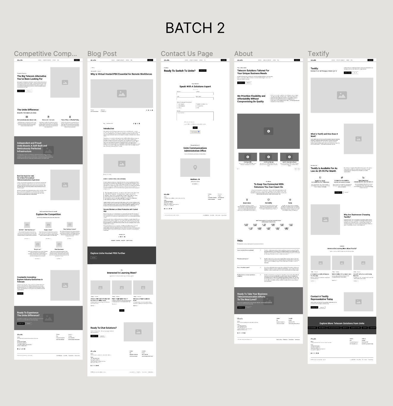
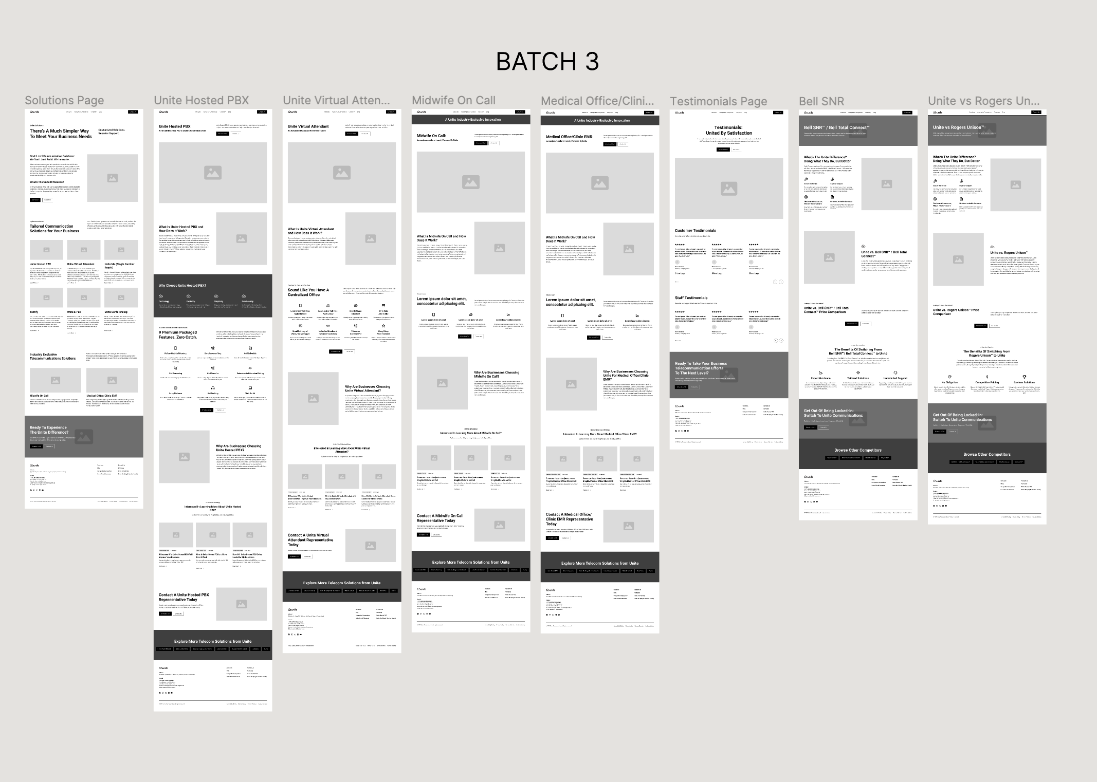
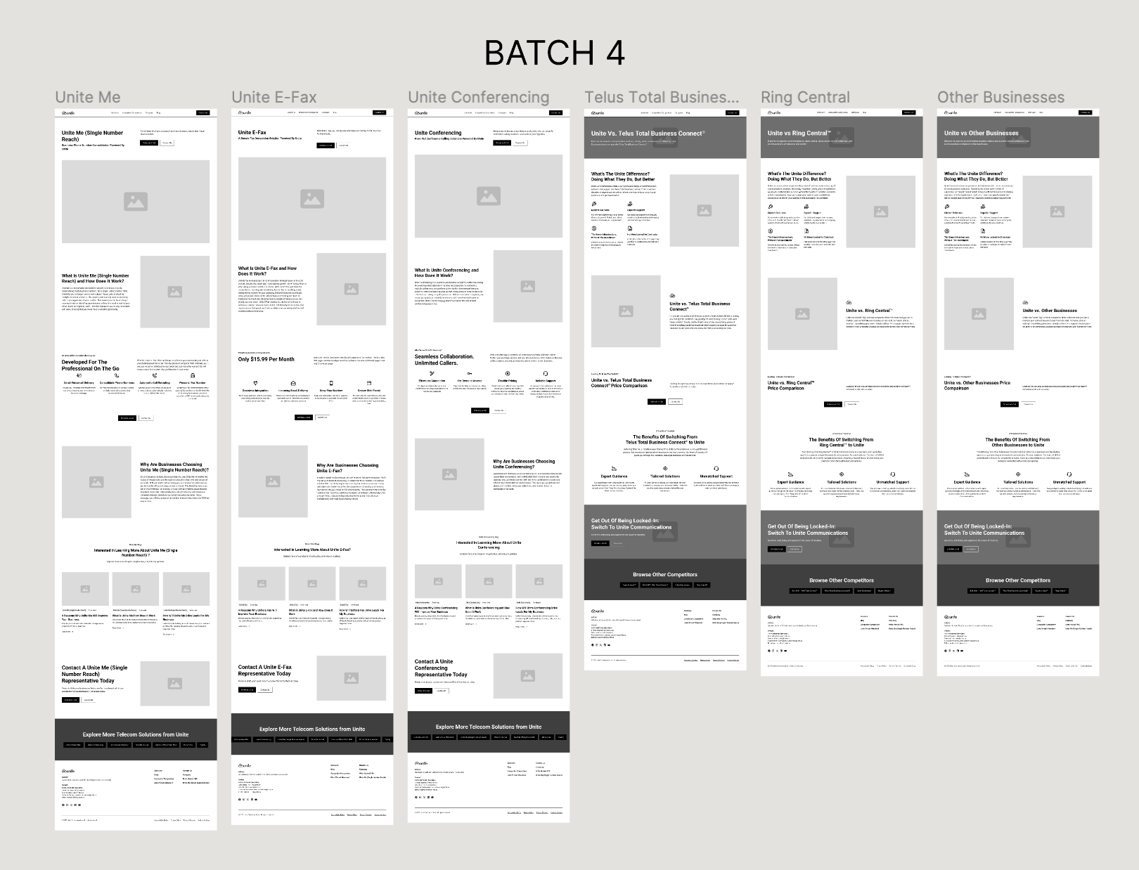
We also took the time to reconsider Unite’s current sitemap. Our main goal was to help streamline the navigation for users, reducing confusion and enhancing user experience. A well-structured sitemap can also help improve search engine visibility, driving organic traffic to Unite’s website and boosting its online presence. Presenting the sitemap to the client also allowed for early feedback and alignment on the structure and content priorities.
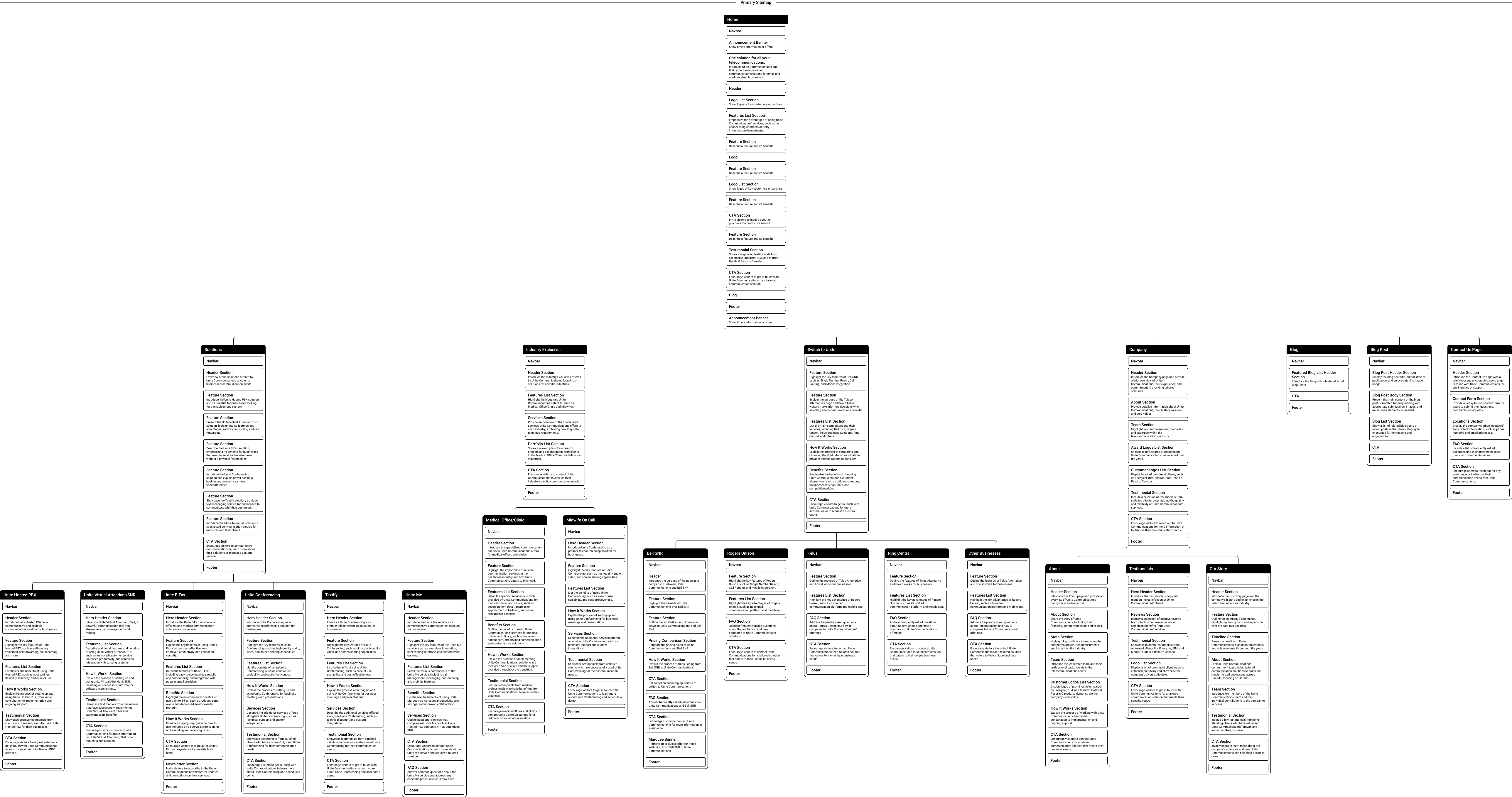
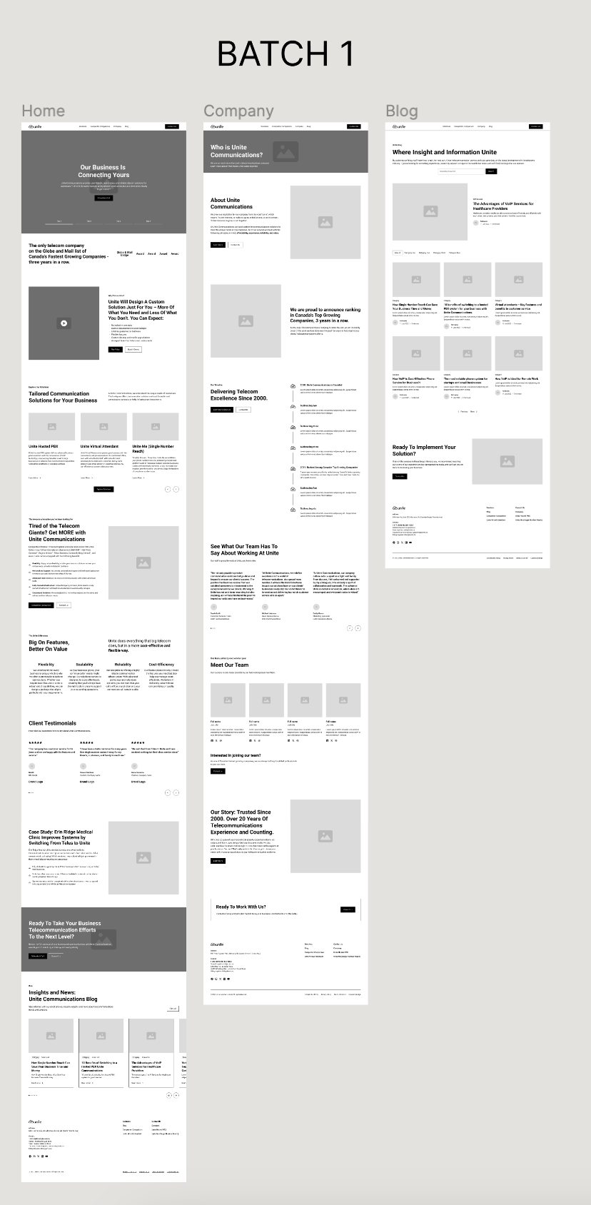
Once the sitemap was approved, we moved on to wireframes. Wireframes helped provide a visual roadmap for the layout and functionality. This also allowed us to identify usability issues early, and iterate on solutions for optimal user experience. Working in batches also helped the client better understand their content and refine it easily.
Initial Design
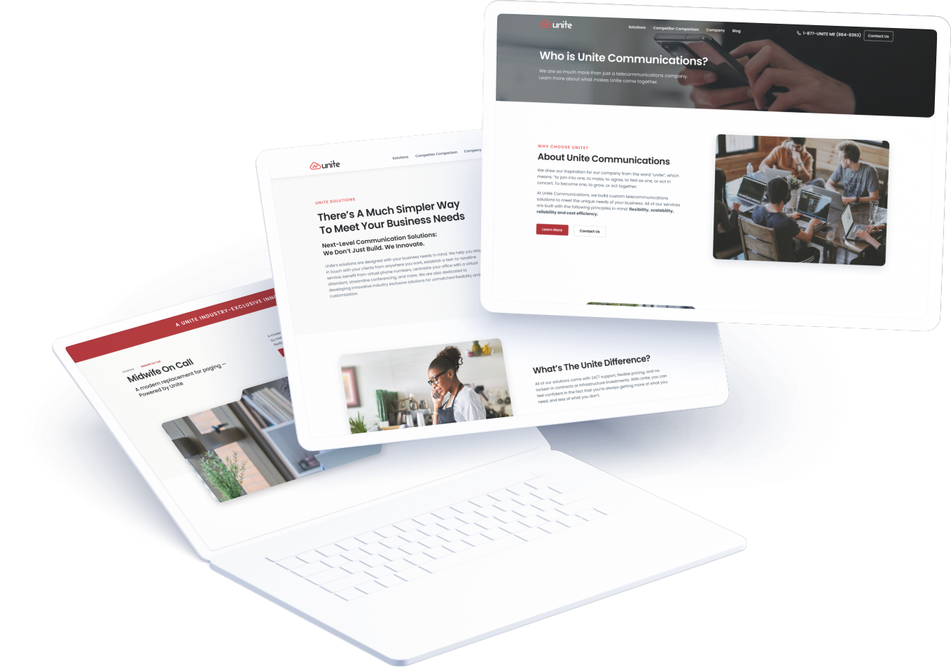
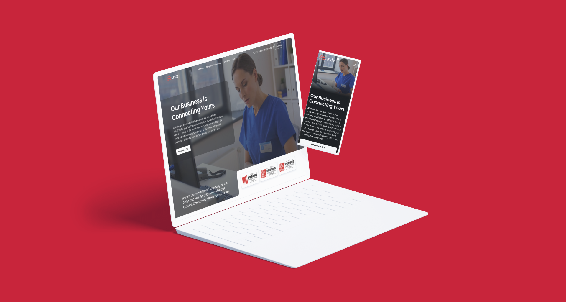
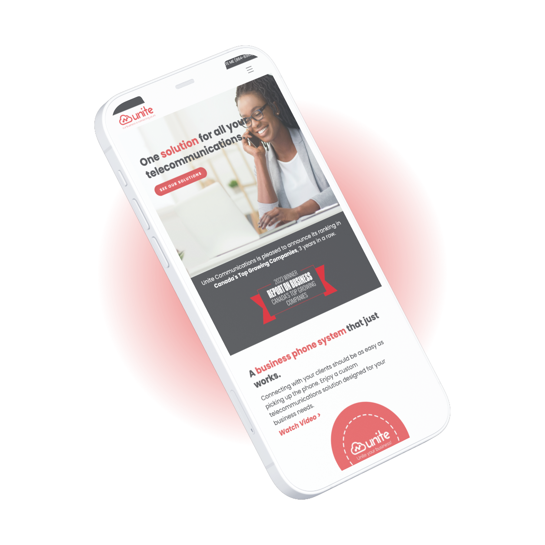
With the direction established through the mood board and stylescapes, we proceeded to translate our conceptual ideas into tangible design mockups. Our focus during this phase was to create a visually stunning and user-friendly home page design that encapsulated the essence of Unite Communications’ brand identity. We developed desktop and mobile mockups to provide the client with a comprehensive overview of the proposed look and feel of their new website across different screen sizes and devices.
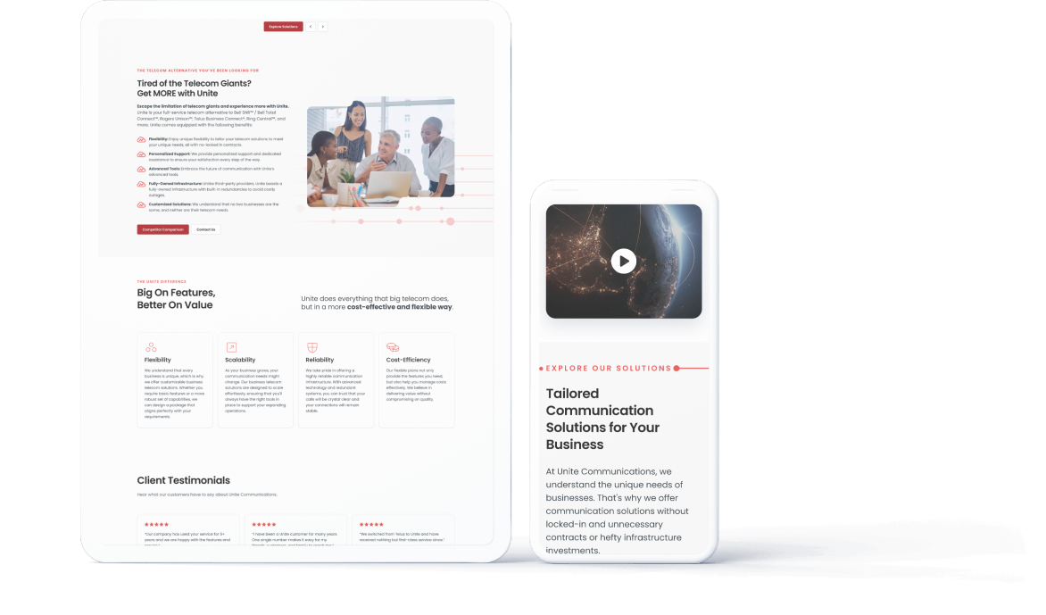
The initial design mockups showcased key design elements, including:
- A clean and modern layout that prioritized clarity and ease of navigation.
- Engaging visuals and photography that captured the essence of Unite Communications’ brand personality.
- Thoughtfully curated content sections that communicated the brand’s value proposition and service offerings effectively.
- Intuitive user interface elements and interactive features to enhance user engagement and interaction.
By presenting the initial design mockups, we invited the client to provide feedback and iterate on the design direction, ensuring that the final product would meet their expectations and objectives. This collaborative approach fostered transparency, creativity, and alignment throughout the design process, ultimately leading to the development of a compelling and impactful brand identity and website for Unite Communications.
Results
Refreshed Brand Identity
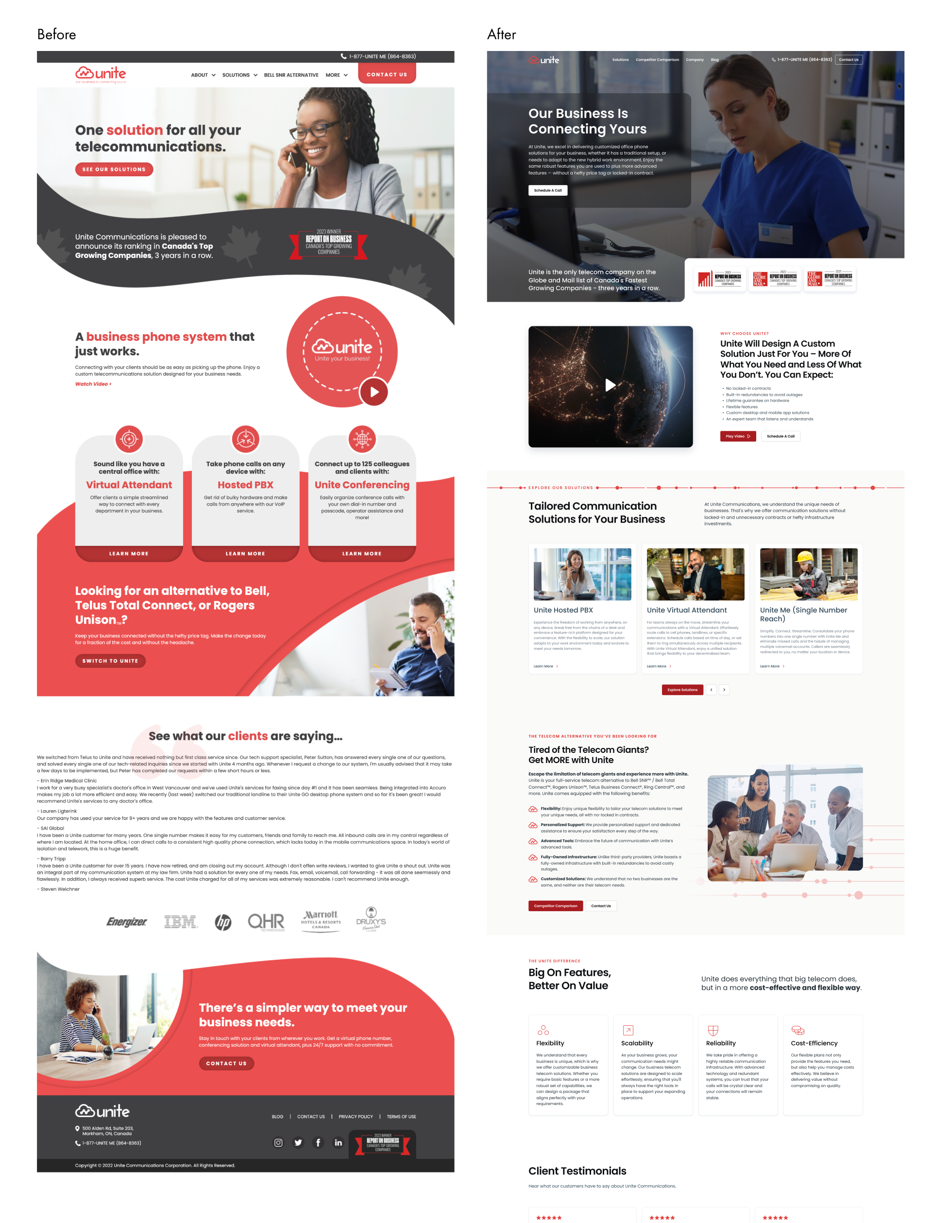
The updated brand identity successfully modernized Unite’s image, conveying professionalism and reliability while maintaining brand recognition.
New Website
The redesigned website showcased Unite’s services and solutions in a visually engaging and intuitive manner, enhancing user engagement and conversion rates.
Positive Feedback
The client received overwhelmingly positive feedback from both existing and prospective customers, affirming the success of the rebranding and website redesign efforts.
Increased Credibility
The revamped brand identity and website positioned Unite as a leading player in the communications industry, instilling confidence and trust among stakeholders.
